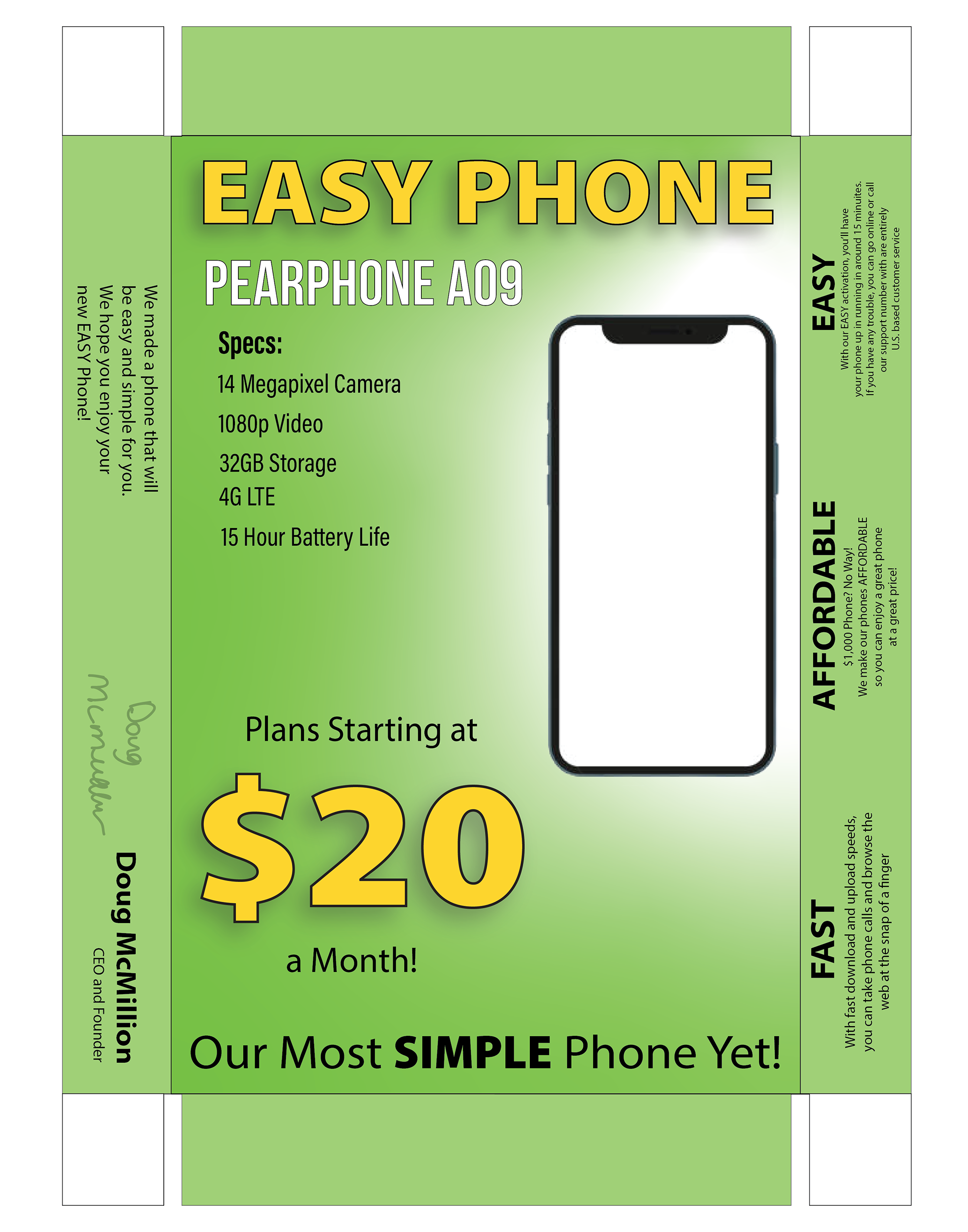
Created in Adobe Illustrator, this box lid template was part of a packaging design project where we developed an original product and its branding. I created the “Easy Phone,” a phone designed for people who aren't tech-savvy and want something simple to set up and use. I used large, easy-to-read text with an older audience in mind, including users who may have difficulty reading smaller text. I also used an Apple Pencil to create the signature, which was my first time incorporating it into an Illustrator project.
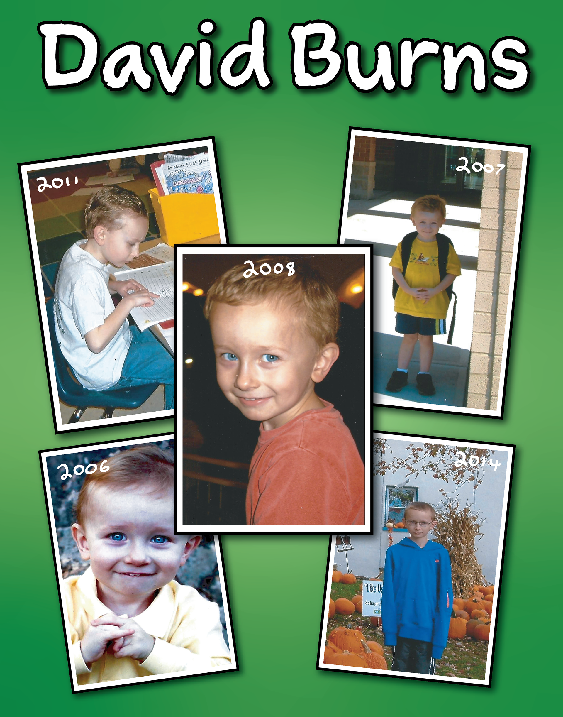
This was a personal project I made before graduating from Mason High School. Every year, graduating seniors take part in a parade around MECC, the district's elementary school. Many of us made posters with pictures of ourselves from when we were in elementary school so our former teachers could recognize us. I decided to design mine in Adobe Illustrator and printed the final design on an 11 × 14 poster board.
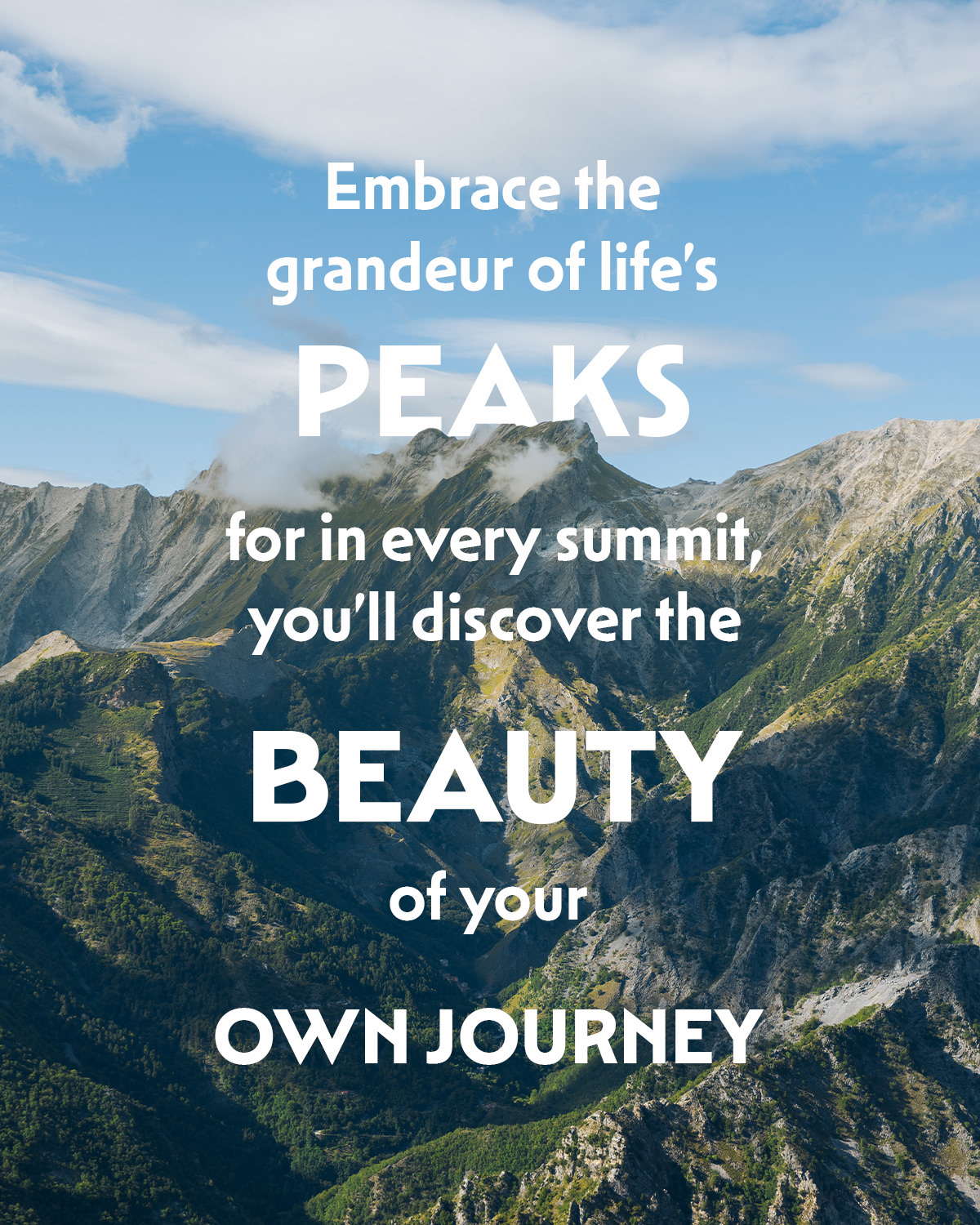
This project focused on using typography to visually communicate the feeling of an inspirational quote. I chose a mountain landscape that fit the message and used differences in font size and weight to emphasize words like “peaks,” “beauty,” and “own journey.” I also layered the mountain peak in front of the word “peaks” to create depth and connect the typography with the image. I kept the text centered and used white type to create contrast against the background while keeping the quote easy to read.
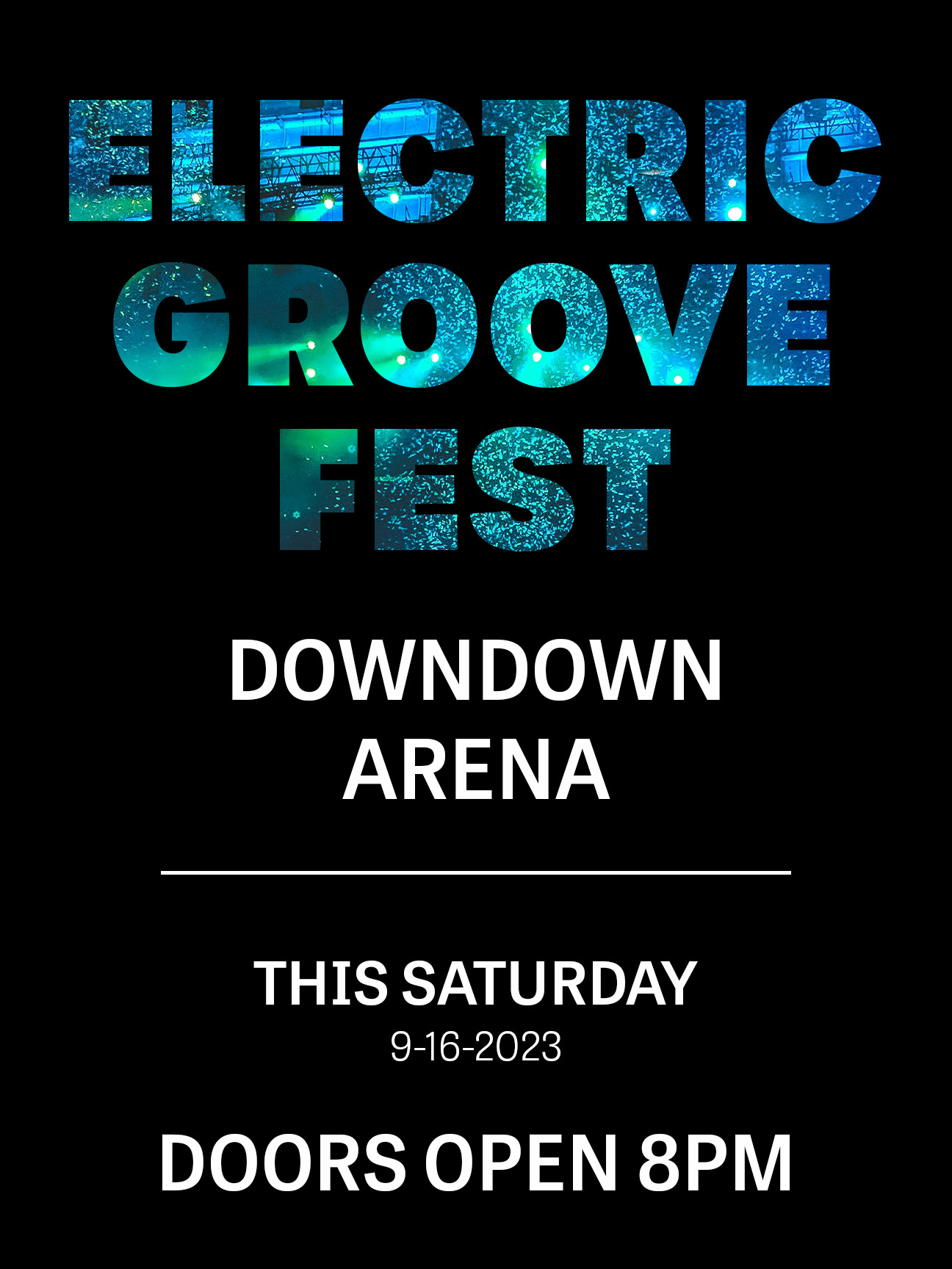
This event poster was created in Adobe Photoshop for a fictional electronic music festival. I used photos of concert lighting and crowds inside the event title to connect the typography with the theme of the event. I used differences in text size and weight to create a clear visual hierarchy, making the event name the main focus while keeping the date, location, and time easy to find.
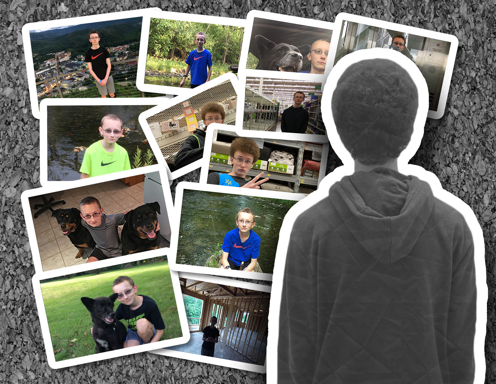
I made this during my Digital Image Design class in high school, and it was the first project I ever created in Photoshop. I used multiple images, layers, and effects to create a collage of myself looking back on different parts of my childhood. I added white strokes around the photos and arranged them to look like pictures pinned to a corkboard.

I created this holiday card in Adobe Illustrator using shape and drawing tools. I wanted to keep the design simple, so I used a traditional red and green holiday color scheme and created the mountain shapes myself. I used layering, outlines, and shadows to give the mountains more depth and separate them from the background.